Yes, this primarily applies to 'template' pieces - this was done with the following layers:
- Flat colour background - I use purple, since it's easy to see what I'm doing.
- Smoothed shading layer
- Hatched 'sketch' shading layer
- Smoothed highlighting layer
- Hatched 'sketch' highlighting layer
- Secondary 'sketch' highlighting layer for extra shine on mane and tail
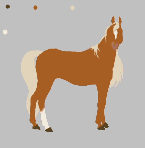
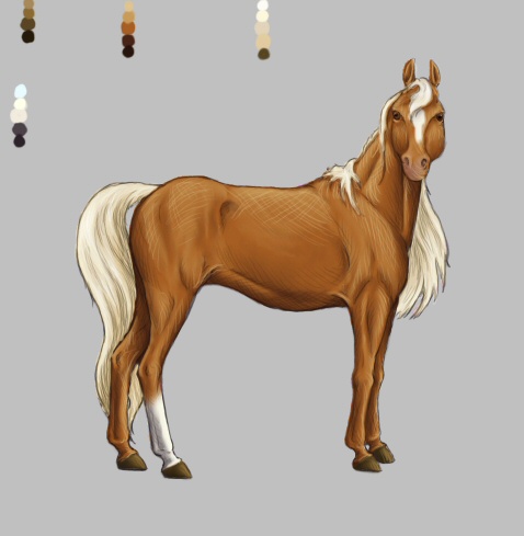
To the left you've got the flat colour background, painted in to be a bright, flaxen chestnut colour with one high white sock and a broad star/stripe. The roundish dots in the right corner along the top are colour swatches so that you can see exactly what colours I used. I try very hard when doing computer art not to use 'saturated' colours - the colours I choose are closer to the grey side of the colour picker than to the full 'neon' side. That tends to make more -realistic- colours for horses, since even the flashiest palomino isn't going to be bright true saturated 'chromium yellow' - they've always got a little bit of a shade of grey or brown in it.
Anyhow, sort of a warm orange-brown for the base shades, a medium cream tone for the mane and tail, dark brown hooves and a shade that's just off white (in the cream/orange scale) for the 'chrome'. I didn't blend any of them together at first, left the edges sharp, so that Paint Shop Pro 8's colour replacer tool will work to best effect. The pinkish mauve colour on the muzzle and the smoothing of the white stocking came after completing the shading/lighting effects.
To the left now you've got the smoothed shading layer, after it's
been colour-shifted to match the horse. Again, there are colour
swatches.
To shade the chestnut of the body, I went for a dark, fairly dull red-brown, a 'cooler' colour on the scale - too saturated and you get a 'glow' effect that doesn't look at all realistic. Trial and error works wonders for learning how to get this to work, and I still occasionally pick a colour, try the colour replacer, go YARRGH! and hit 'undo'.
The mane and tail have been shaded with a darker, more orange gold tone, again, making the shading slightly 'cooler' than the original hues.
The hind sock and the blaze are shaded with dark, very grey -purple-. That sounds odd, but the cool, dark tones of it work better than using true grey and wind up contrasting nicely with the very warm tones of the body - which makes the sock, in turn, look whiter and cleaner in the finished product (Remember I used a pale cream colour for the markings, too - so I've countered the yellow tone!)
Lastly, the hooves are shaded with a dark, cooler brown than they are.
In shading, remember to use cool colours or colours that are the -reverse- of the colour you've used as a base tone. You get more depth and contrast than if you'd used black to achieve the same tone.
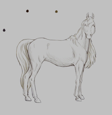
Now for the hatched 'sketch' shading layer - which adds another point of contrast and stops the colour from being too flat - though having three tones (Base hue, one shade and one tint) is often sufficient, in my digital paintings I quite often find myself using seven to nine different tones to further show form.
It looks pretty homogenous from here - they're obviously darker than the other shading colours used, but it's difficult to tell that I've used an even deeper red-violet for the body shading, a deep dark umber-brown on the orange scale for the mane and tail, and a very dark purple-blue for the stocking and hooves.
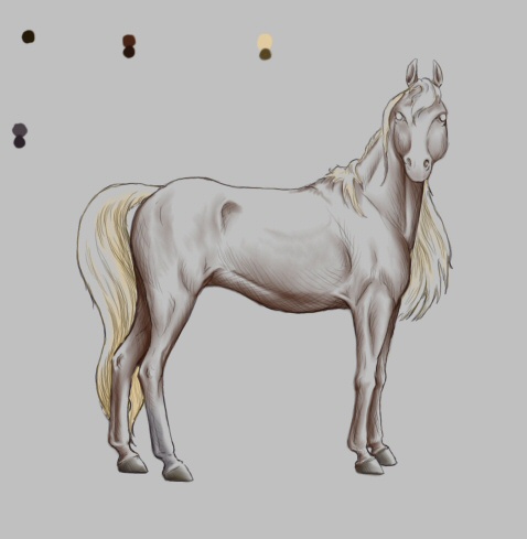
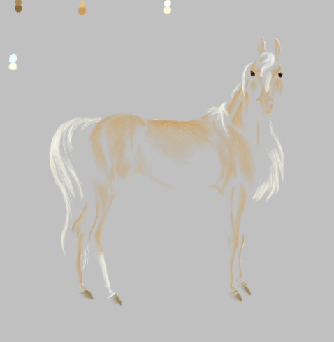
Now you can see the two shading layers combined - and see how they compliment each other.
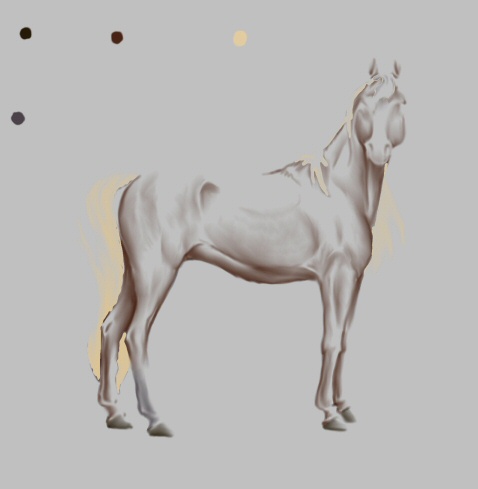
Now for what you asked about - how to make 'shiny' without using white. This is the smoothed highlighting layer, after it's been shifted from pure bright white.
All the colours here have been shifted towards the warmer side of the spectrum - more yellow than the base tones.
For the chestnut tone, it's a shade of medium golden-orange, not too bright, but enough to give shape.
For the mane, tail and white markings, it's a pale, fairly saturated yellow tone - because sunlight is slightly yellow, this 'makes sense' to the eye.
Lastly, the hooves are a warm golden brown shade.
Notice too that I've done the eyes on this layer - though that's done last of all, once I'm happy with all the colours.
In highlighting, remember to use warm colours towards the yellow end of the spectrum - or, conversely, reflections of the sky. You get more brightness and shape than if you'd used white to achieve the same visual tone.
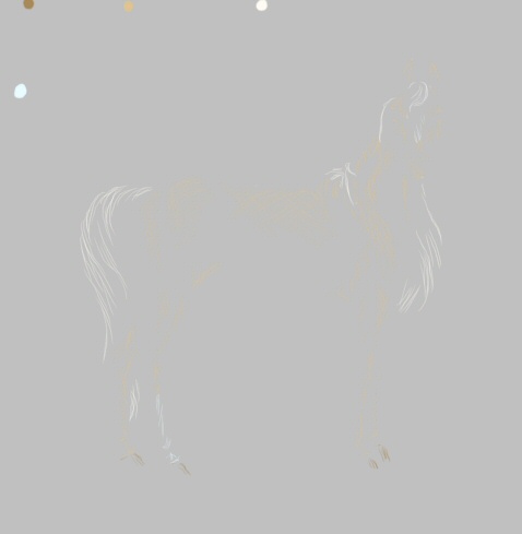
And then the hatched 'sketch' highlighting layer...
Yellower tone of gold for the chestnut highlights - not too pale, though, since I wanted a richness of colour rather than a real bright glossy feel.
Then an even paler nearly-white for the mane and tail only.
The interesting bit comes from the sock... which is highlighted in pure pale blue. Again, this is an atmospheric effect that 'brightens' white as the eye perceives it - given a tone of blue-white or a tone of yellow-white, people see the blue tint as being 'more white' - sometimes even more white than white itself.
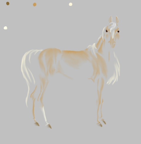
Next, the two highlighting layers combined.
Now for an interesting effect - what happens when you combine the highlights and shading without seeing the base tones.
Your eye can identify this as a chestnut horse with a pale mane and tail and white markings even without the original depth of tone - because you've used colours to make the shape, and made the colours do what your eye expects of a three-dimensional object - rather than just relying on shades of grey.
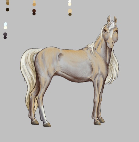
And finally, what it looks like when you put it all together, complete with all four colour swatches.
Let me know if this helps!
All images © C. Ssthisto Reid 2005